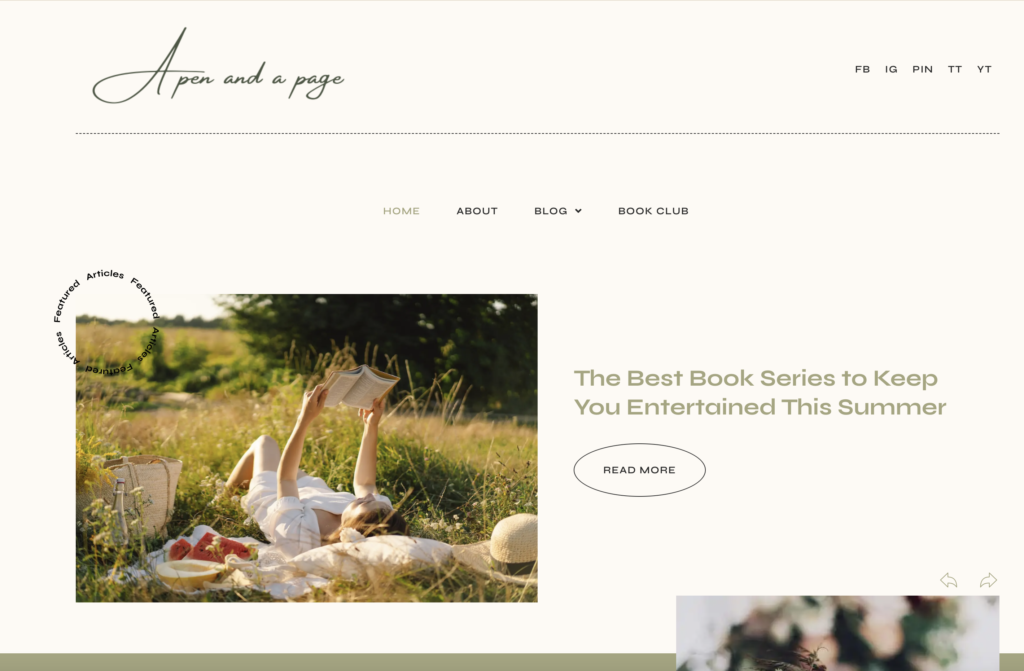
When tasked with the design of “A Pen and a Page,” the goal was clear: to create a digital space that encapsulates the beauty and depth of literature, while providing a user-friendly experience for readers of all kinds. The design journey was as fascinating as the stories the website aims to share.

Aesthetic Appeal
The first step in the design process was to ensure the website’s aesthetic appeal. The design needed to reflect the essence of literature – timeless, elegant, and captivating. To achieve this, a clean, minimalistic design was chosen, with a focus on typography and white space. This not only gives the website a modern and sophisticated look, but also ensures that the content is the star of the show.
User Experience
The next step was to ensure a seamless user experience. The website was designed with intuitive navigation in mind, making it easy for users to explore different sections such as the blog, book club, and featured articles. The layout was designed to be responsive, ensuring a smooth browsing experience across different devices.
Content Highlight
The design also focused on highlighting the website’s rich content. Featured articles are prominently displayed on the homepage, enticing visitors to delve deeper into the literary world. Each article is accompanied by a compelling image and a brief summary, providing a sneak peek into the content.
Future-Proof Design
The design has been future-proofed to accommodate growth and changes. The flexible design allows for easy updates and additions, ensuring that “A Pen and a Page” can continue to evolve and cater to the ever-changing tastes and preferences of its readers.
Designing “A Pen and a Page” was a journey of blending aesthetics with functionality, creating a space where literature can be celebrated and enjoyed by all. It stands as a testament to the power of good design in enhancing the way we engage with content, and the joy it brings to the reading experience.


