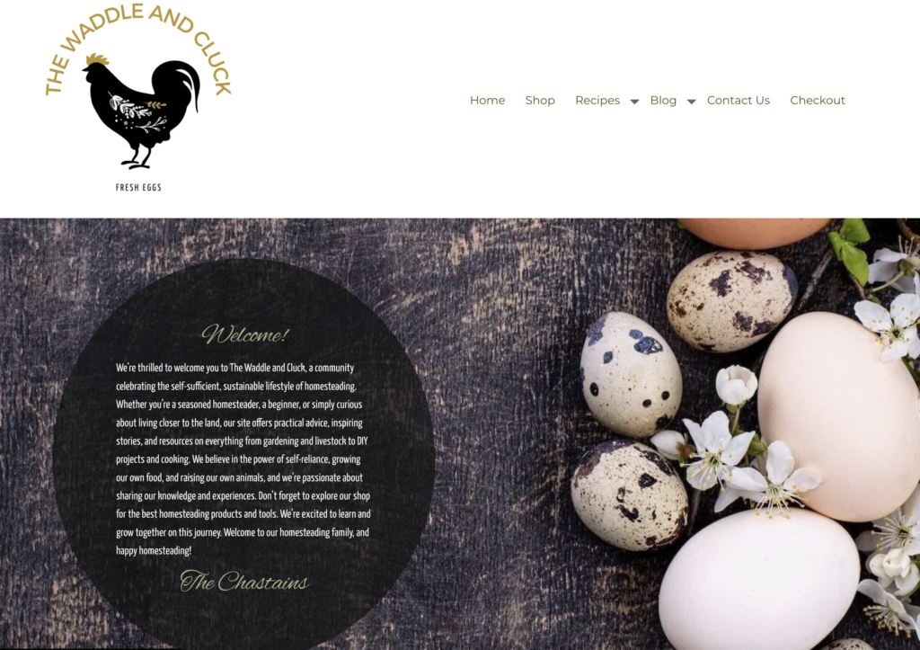
I had the opportunity to create a visually appealing and user-friendly website for The Waddle and Cluck, a delightful farm-to-table restaurant specializing in poultry dishes. Join me as I guide you through my design approach, key features, and the overall user experience I aimed to achieve.
Design Approach:
My design approach for The Waddle and Cluck website revolved around showcasing the restaurant’s farm-to-table concept, creating a warm and inviting atmosphere, and highlighting the mouthwatering poultry dishes. I wanted to capture the essence of the restaurant while providing a seamless and delightful experience for visitors. To achieve this, I embraced a rustic design aesthetic, incorporated vibrant visuals, and focused on intuitive navigation.
Key Features:
1. Charming and Welcoming Homepage:
The website’s homepage served as a virtual welcome mat to The Waddle and Cluck. I aimed to create a charming and inviting atmosphere through a combination of earthy color tones, playful typography, and carefully selected imagery. The layout was designed to be visually appealing and easy to navigate, allowing visitors to quickly access essential information about the restaurant.
2. Farm-to-Table Philosophy:
To showcase The Waddle and Cluck’s commitment to locally sourced ingredients and farm-to-table dining, I dedicated a section of the website to highlight their philosophy. Through engaging content and captivating visuals, visitors could learn about the restaurant’s partnerships with local farmers, their sustainable practices, and the quality and freshness of their poultry dishes.
3. Menu Showcase:
The heart of The Waddle and Cluck website lay in its menu showcase. I designed an interactive and visually enticing menu section where visitors could explore the variety of poultry dishes offered. Each dish was presented with mouthwatering imagery, detailed descriptions, and pricing information. I also incorporated allergen information to accommodate dietary preferences and restrictions.
4. Reservation System:
Recognizing the importance of online reservations, I integrated a user-friendly booking system into the website. This feature allowed visitors to conveniently book a table, select their desired date and time, and specify any special requests. By streamlining the reservation process, I aimed to enhance customer satisfaction and ensure a smooth dining experience.
5. Customer Reviews and Testimonials:
To build trust and credibility, I included a section on the website where customers could share their dining experiences and leave reviews. Testimonials from satisfied patrons highlighted the exceptional service, delicious food, and charming ambiance of The Waddle and Cluck. This feedback section served as social proof and influenced potential visitors’ decisions to dine at the restaurant.
User Experience:
My primary focus was to provide visitors with an enjoyable and immersive user experience on The Waddle and Cluck website. By combining a warm and inviting design, intuitive navigation, and a user-friendly interface, I aimed to create a seamless and delightful browsing experience. I conducted user testing, gathered feedback, and continuously refined the website’s usability and functionality to ensure the best possible experience.
Conclusion:
Designing The Waddle and Cluck website was an exciting and fulfilling project for me. Through a combination of rustic aesthetics, intuitive navigation, and a focus on the farm-to-table concept, I successfully created a website that reflects the restaurant’s charming ambiance and highlights its mouthwatering poultry dishes. I present this portfolio as a testament to my dedication and expertise in web design and my commitment to creating delightful online experiences for my clients and their customers.


